
Look Like the Business You’ve Become.
A strategy-led rebrand and logo system for established businesses moving up-market. We don’t redraw a logo and hope. We build the strategy, the identity and the templates as one system, so every touchpoint says premium, specialist and serious.
A Logo Is Not a Brand.
Most agencies hand you a prettier logo and a colour swatch, then leave you to work out what it all means. You end up looking slightly nicer and pulling the same weight. A brand that sells is built the other way around.
- First impressions decide. Bigger, more established clients judge you in seconds. If the brand looks like the old you, you lose them before the conversation starts.
- Moving up-market changes the bar. Pursuing serious clients across new industries means the brand has to signal premium and specialist authority, not “we’ll take any job”.
- Consistency is the moat. One coherent system across web, social, decks and email is what makes a business look like the category leader. Scattered assets read as amateur.
- Strategy before pictures. If the words, themes and positioning aren’t locked first, the visuals are just decoration. We fix the foundation, then design on top of it.
Four Steps. One Coherent Brand.
We work in the order that actually builds a brand: words before pictures, system before assets. You see and sign off each step before we move on.
Brand Strategy Framework
We distil who you are into the key themes, tone of voice, brand DNA and the statements that anchor everything. The foundation the visuals sit on.
Visual Pitch
The evolved logo and mark, colour palette, typography and the overall look, presented as a system designed around the strategy, not decoration bolted on after.
Brand Guidelines
The rulebook so the brand stays consistent everywhere, by anyone. Logo clear-space and sizing, colour and type rules, do’s and don’ts, voice.
Templates & Rollout
The brand applied to the things you actually use: pitch deck, social tiles, email, landing pages and business collateral. Ready to publish.
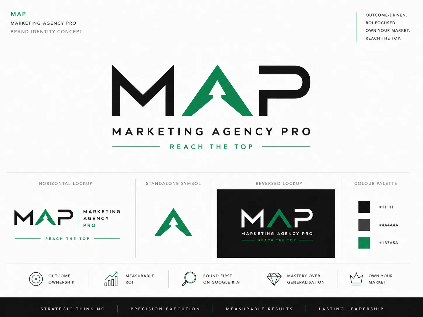
The MAP Rebrand.
The clearest proof of how we work is our own brand. Here is the real framework we built, the same one you’d get, applied to Marketing Agency Pro.
We Own the Outcome
We take ownership of the result: the enquiries, the clients, the bottom line. Clear expectations from day one, no excuses, no surprise upsells.
Found First on Google and AI
Search has split into two front doors. Ranked on page one of Google and named first by AI engines. Win both and you own your market.
Results, Never Vanity
Rankings and traffic are steps, not the scoreboard. We measure in enquiries, clients and return, backed by a guarantee.
Mastery Over Generalisation
We go deep, not wide. Specialist strategy beats a generalist agency spreading itself thin. Depth is the moat.
Ownership of the result, end to end.
Crystal-clear expectations from day one.
Everyone accountable to your ROI.
Owns the result and the standard.
Transparent, calm, high-trust.
Over-delivers on purpose.
Successful owners across industries.
Serious about being number one.
Done being “just a number”.
Plain language, no jargon.
Lead with the result.
Honest, never hype.
Clear on what’s happening and why.
Able to trust us completely.
Enthusiastic about what’s next.
Quality ingredients you trust. Tastes good now, compounds over time, exactly like SEO and AEO.
Humble, genuine, world-class without showing off. Lets the work do the talking.
The benchmark for craftsmanship. Understated power, built to the highest standard.
Every detail engineered for performance. Precision under pressure, relentless improvement.
Gravitas, warmth and exactness in one. Authoritative and genuinely enjoyable.
Premium but approachable. Built to perform, at home in any room, any industry.
- Owners of the outcome
- Transparent and clear
- Specialists, premium
- Warm and human
- Results-obsessed
- The standard-setter
- Excuse-makers
- A black box
- Generalists, cheap
- Cold or corporate
- Vanity-metric sellers
- Forgettable
The upward peak in the A is the climb to the top. Black for authority, green for growth.
We own the outcome for established business owners, engineering visibility on Google and AI into real ROI, with the transparency, mastery and warmth that leaves clients in control, clear and confident they are with the right team.
The Full Brand, Not a Logo File.
Everything you need to launch and stay consistent, handed over ready to use.
Brand Strategy Framework
Themes, DNA, mission, vision and tone of voice.
Logo Suite
Primary, secondary, icon and reversed versions for any background.
Colour & Type System
Palette with usage rules and a complete typographic scale.
Brand Guidelines
One document so anyone can keep the brand consistent.
Core Templates
Pitch deck, social tiles, email and business collateral.
Sales & Landing Page Direction
The brand applied to the pages that convert.
What a Real Rebrand Changes.
Not vanity. A brand that does a job: opens bigger doors, holds a higher price, and runs as one system.
Punch Above Your Size
Show up like the established, premium operator you are, so bigger clients take you seriously from the first impression.
Charge What You’re Worth
A premium identity supports premium pricing. The brand stops being the reason a prospect hesitates.
One Coherent System
Web, social, decks and email all pulling in the same direction. Consistency that reads as category leader.
Brands We’ve Built That Clients Recognised Instantly.
“The website delivered was completely aligned to our brand. Communication throughout was excellent.”

“Exceptional knowledge with clear strategic direction. Generous with time and easy to work with.”

“Deep expertise combined with strategic clarity. Delivers what he promises.”

Ready to Look the Part?
Book a brand call. We’ll show you exactly where your current brand is costing you, and what the rebrand would look like, with no obligation.
See What Your Rebrand Could Look Like.
Book your free brand call. We’ll walk your current brand, show you where it’s holding you back, and map the rebrand and logo system step by step.
This isn’t a sales call. It’s a strategy session. If you decide to engage, you’ll bring it up.